Redesigning "MyDavisCalifornia"
Reimagining a local community site through an accessibility-first lens!
Context
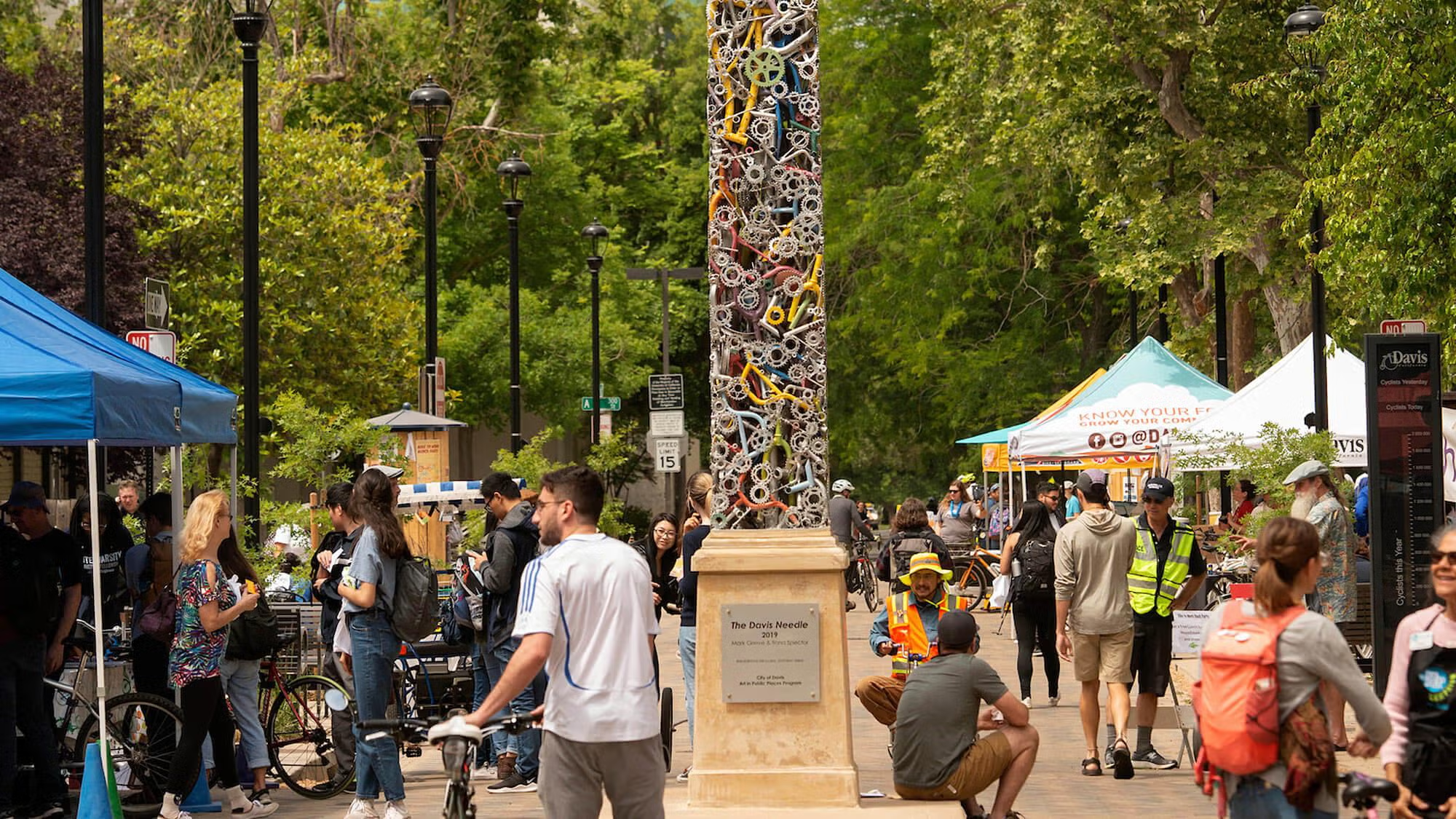
Growing up in Davis, California, I often perused on MyDavisCalifornia - a small travel and community site - to stay connected with local events and restaurant deals. But when I visited the site from my phone again as an accessibility-minded college student with UI experience, I realized just how unusable and inaccessible it was.
As a product manager who believes in people before pixels, I saw this not just as a visual flaw but a community access issue. A poorly designed site meant fewer people in Davis - especially older adults, newcomers, and mobile users - could benefit from local resources. This project was my attempt to change that!
Objective
Redesign the Listings page of MyDavisCalifornia to be responsive, accessible, and intuitive across all platforms.
Key Problems
When digital platforms fail accessibility standards, they don't just create usability issues - in this case, they can create economic barriers for real community members. MyDavisCalifornia's inaccessible design may exclude various user groups who rely on these local business discounts.
Thus, to narrow down the specific technical issues I wanted to address, I evaluated the page based on learnability, memorability, efficiency, and accessibility - the pillars of usable interfaces. I also then used tools like WebAIM WAVE to identify areas where the existing site was lacking.
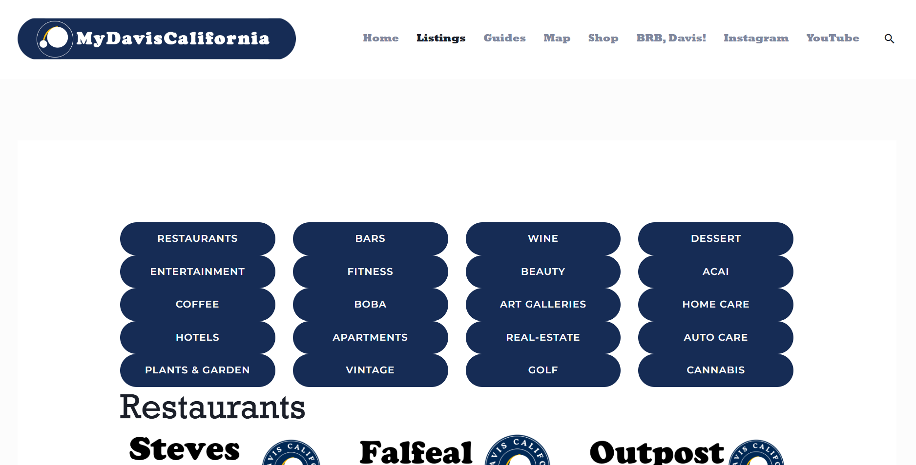
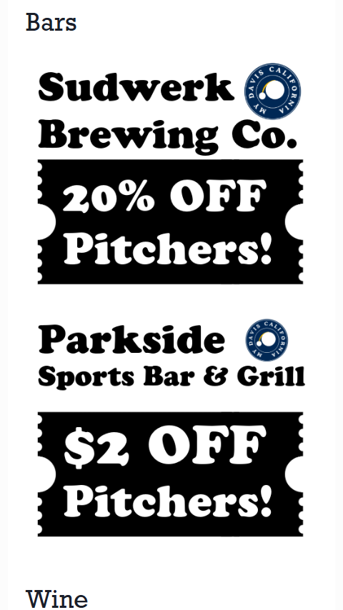
Screenshots
Below are screenshots of the current Listings page on different screen sizes. The lack of responsive design elements is evident across all viewports.
Desktop View (1440px × 1024px)

Tablet View (744px × 1133px)
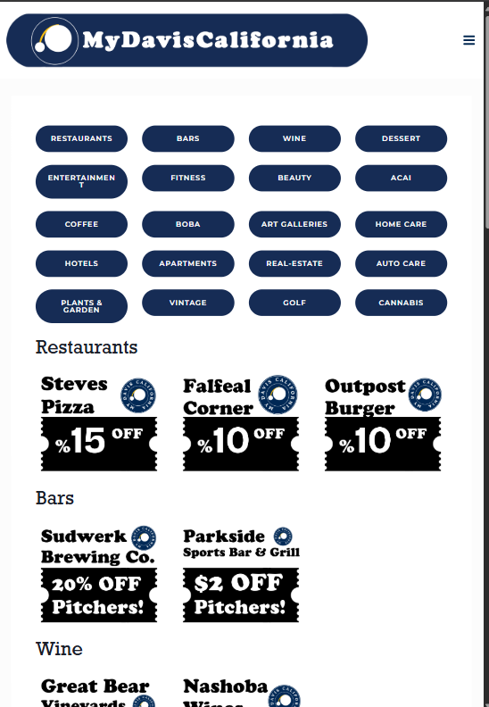
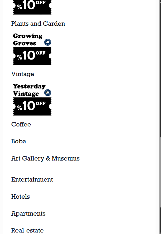
Mobile View (375px × 662px)
Poor learnability
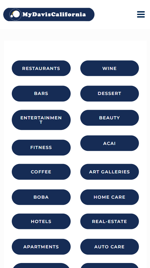
The category buttons were crowded and looked like static labels. First-time users had no idea what the page was for or how to use it. There was no title or context, which left people confused from the start.
Bad memorability
Listings lacked brand logos or distinguishing features, making it hard to recall which coupons users had seen before. Sections were mismatched or empty, breaking user trust.
Inefficient navigation
Large buttons and vertical stacking forced users to scroll repeatedly to explore deals. Some buttons didn't even lead anywhere, creating wasted clicks.
- 100% of coupon images lack alt text, excluding screen reader users
- 2 broken navigation links
- Missing H1 headings confirmed by screen reader testing
- Low contrast text failing WCAG standards, impacting visually impaired users
Fixing these issues meant thinking deeply about how people feel when they arrive at a site and can't find what they need. Thus, it was critical I empathized with various user groups throughout this proces.
Who This Affects
While specific community demographics vary, these accessibility issues impact all users, with particular challenges for:
- Students on mobile devices seeking quick access to deals
- People using screen readers
- Users with vision challenges reading low-contrast text
- Honestly, anyone trying to navigate the site efficiently
User Alternatives
Users have alternatives like Groupon or Yelp, but MyDavis offers unique very local curation with better deals. When accessibility fails, users may abandon or not be able to use the platform despite its unique offerings.
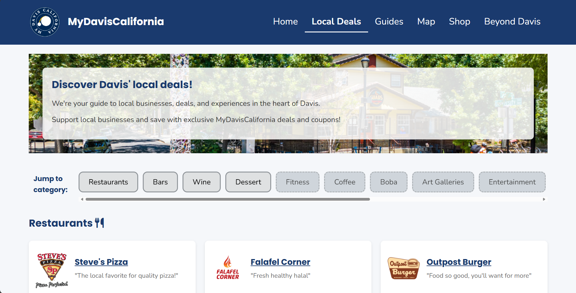
Mockups
Before attempting to redevelop the website, I first went to Figma to create a set of responsive mockups and a visual style guide. As a product manager, mockups are a communication tool, not just for aesthetics, but to align everyone (designers, developers, stakeholders) on what a successful product looks like. Anything I lead or create must be well-documented and understandable by others.

Design Decisions & Tradeoffs
During the mockup and coding process, I made some difficult design decisions to balance user experience with technical constraints. Below are several key decisions and their tradeoffs.
Horizontal scroll for categories
Decision: Made category buttons scrollable horizontally.
Why it matters: Prevents vertical clutter (mobile especially).
Tradeoff: Horizontal scroll is less discoverable, especially for keyboard-only or less tech-savvy users.
Card-based layout
Decision: Represented listings as visually distinct cards with logo, name, and tagline.
Why it matters: Improves memorability - mental model groups content!
Tradeoff: Increases vertical space used.
Font & Theming Choices
Decision: Replaced the original site fonts with more legible, accessible typefaces.
Why it matters: Supports better readability, especially for users with visual impairments or dyslexia.
Tradeoff: Loses some of the quirky charm of the original branding. A future compromise could involve reintroducing decorative fonts for headings only :)
These decisions were guided by my commitment to accessibility, usability, and visual clarity - even when it meant letting go of some of the original site’s unique features. You can see these decisions reflected in my mockups:


Implementation
After creating the initial mockups, I then translated them into code (in HTML and CSS) while preserving the intention of accessibility, ensuring every component worked with keyboard navigation, focus order, and responsive behaviors.
To visit the live redesigned website, click here. I've included screenshots below.

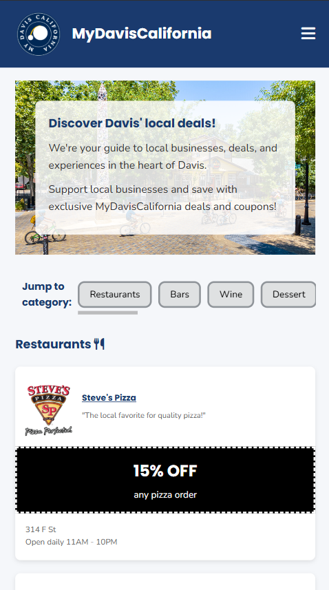
Accessibility fixes
- Alt text added to all logos and images
- Improved heading hierarchy and page landmarks
- Keyboard navigation supported across all interactive elements
- Color contrast meets WCAG AA guidelines
Impact & Reflection
This project reaffirmed my belief that good design is not just about aesthetics, but is also about empathy and access. Even small fixes like rewording a heading or changing button contrast can help someone feel welcome on a site!
As a product manager, I saw firsthand how attention to detail and intentional decision-making can create more equitable user experiences. I also sharpened my technical skills in HTML/CSS, Figma, and WebAIM, which will help me empathize with developers I may manage in the future.
After the redesign, I actually shared the site with Davis locals and received feedback from older users who said they could understand and access the coupons much better! That motivation will drive my future projects :)