CIT Elevator Case Study
Analyzing accessibility and usability of a campus elevator system
Introduction
Context
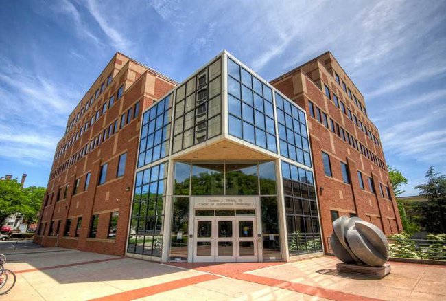
As a frequent visitor of Brown’s Computer Science building (the CIT), I’m quite familiar with its elevator interface! But after injuring both of my feet last year, I started noticing how much friction some supposedly accessible systems create - especially for people who move, think, or navigate differently.
This project seeks to analyze a real-world interface that many users - students, faculty, and visitors - interact with daily. While it seems minor, poor design in something as fundamental as an elevator can lead to confusion, delay, and even exclusion.
Objective
Better understand how users experience the CIT elevator panel and provide actionable suggestions to improve access, feedback, and usability.
Preparation
I chose to analyze the interactive panel of elevator 1E1 inside the CIT at Brown. The panel includes floor buttons, a swipe reader, and controls like alarm/help. During most of the day, any user can press a button to operate the elevator. But after a certain cutoff time, a valid ID swipe is required before any button press is accepted.
When actions like door open/close succeed, the only feedback is a small indicator light. If a user forgets to swipe, or if their swipe times out, nothing happens. The elevator then closes and defaults to the ground floor, often without the user realizing why.
The primary audience includes CS students and staff, many of whom use the CIT multiple times a day. However, the system must also accommodate visitors, people unfamiliar with swipe access norms, and individuals with disabilities. Their needs and expectations shaped my research questions and observation goals.
Note: I believe card access is given to officially CS-affiliated persons (for undergraduates, this usually occurs the second semester of sophomore year) or those affiliated with some department course or activity.
Sketch
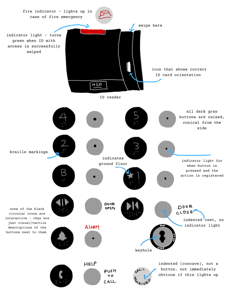
This sketch helped me document the interactive zone from a user’s direct point of view and identify potentially problematic areas (e.g., swipe reader height, unclear button layout). I was able to align my observations with key UI touchpoints.
Observations
I observed three users as they interacted with the elevator panel inside the CIT. Since the panel is located within a shared space, it was easy to unobtrusively observe interactions while I waited on multiple floors throughout different times of day.
User 1
- Entered on the ground floor and immediately pressed a button, which lit up but did not stay on.
- After retrying, they noticed the swipe requirement and swiped their ID in the correct orientation, but the reader flashed red.
- They flipped the card and tried again, still unsuccessful.
- Another elevator occupant informed them they lacked access and swiped on their behalf.
- Once the button stayed lit, the user apologized and proceeded.
User 2
- Entered on the second floor and pressed the button, which didn’t stay lit.
- They pressed it several times before retrieving their ID.
- After swiping, they put their card away before pressing the button, but the swipe had timed out and the elevator defaulted to the ground floor.
- They swore under their breath, repeated the swipe, pressed the button immediately, and it worked.
User 3
- Entered with ID ready, swiped successfully (green light), and immediately pressed the button.
- The floor light stayed on.
- When someone asked them to hold the elevator, they used their hand rather than the door open button to block the doors.
- After the second person entered, they used the door close button to continue.
Observed patterns
- Incorrect expectations: Most users expected the buttons to work without swiping.
- No trust in button feedback: Users spammed buttons or avoided using “door open.”
- Dependency on visual cues: All users relied on button lighting for confirmation.
- Emotional reactions after inefficiencies: Failed swipes or timeout errors led to negative emotions, such as feelings of shame or annoyance.
These patterns demonstrated the system's overreliance on prior knowledge and visual feedback. Even experienced users encountered inefficiencies, and as a PM, this raised an important tradeoff: minimal visual clutter vs. the cost of unclear feedback.
Interviews
After observing elevator use, I conducted brief user interviews to dig into mental models, pain points, and expectations. Here are the themes and insights gathered from three students - a freshman, sophomore, and senior at Brown.
Frequency of Use
Q: How often do you use this panel?
A: The sophomore and senior use it daily for classes, office hours, and meetings. The freshman uses it a few times per week for labs.
Time of Day
Q: When do you typically use this panel?
A: Mostly afternoon and throughout the day based on class schedules.
Expected Behavior
Q: Did the interface behave as expected?
A: Two users expected it to work like other campus elevators and were surprised by swipe behavior. The sophomore noted that in their dorm building, an invalid card triggers a red flash - unlike the CIT.
Feedback Cues
Q: What feedback did the interface provide?
A: All users relied on visual cues, especially the floor button lights. The senior noted that the card reader flashes green and beeps on a successful swipe, but quickly returns to red with no signal for swipe expiration.
Understanding
Q: How confident are you in using all the buttons?
A: They understood the buttons but had never used the alarm or call features.
Confusion
Q: What confused you?
A: The freshman didn’t know about the swipe requirement. The sophomore didn’t realize it was required at that time of day and struggled to swipe while holding items.
Asking for Help
Q: Have you asked for help before?
A: Yes. The senior was recently on crutches and often couldn’t swipe quickly enough and relied on others. Both experienced users learned about swipe access through trial and error the first time they couldn’t access a floor.
Suggestions
Q: What would you improve?
A: Clearer signal for when swipe access is required, card reader staying green while active, tap access instead of swipe, and more visual feedback for the close door buttons.
My study focused on undergraduate users, but the elevator also serves faculty, visitors, and graduate students. I would have liked to include more diverse users - especially those with disabilities whom for the elevator may be the only form of transport. For instance, the swipe reader is placed high, which may be difficult for wheelchair users; joint limitations could affect pressing buttons; blind users may struggle without auditory cues or more tactile options.
Personas
Based on key patterns from interviews and observations, I created two user personas to guide my product thinking. These fictional characters help me empathize deeply with real users - especially when designing for accessibility, clarity, and emotional impact.

Freddy is a first-semester student rushing to a WiCS resume review. She’s unfamiliar with the CIT and anxious about making a bad impression! But she runs into issues at every step:
- Unclear swipe requirement: Freddy expects the button to work immediately without swiping first.
- Button response uncertainty: Freddy presses the floor button multiple times; it lights up when pressed but does not stay lit up.
- Swipe access confusion: The red flashing light on the card reader shows Freddy her swipe didn't work, but she isn't sure why. Is it because her swipe was invalid? Did she face it the wrong way?
- Social anxiety: Freddy hesitates to ask for help and is worried it's obvious she's new to Brown.
Freddy represents first-time users with high cognitive load and low system trust/knowledge - the learning curve and social pressure exacerbate her frustration at the already unintuitive system. Designing for her would means reducing ambiguity and anxiety with clear signals and straightforward onboarding or instructions.
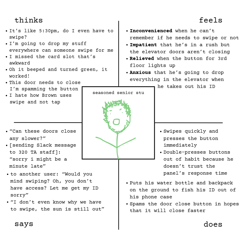
Seasoned Sophomore Stu is a CS320 TA who comes to the CIT daily but still finds the system clunky, especially when he's juggling his belongings:
- Unclear swipe requirement: Even with experience, Stu isn't always sure when swipe access is required.
- Button trust isusues: Stu double-presses buttons out of habit and doesn't trust the panel's responsiveness. When the doors don't close fast enough, he spams the door close button.
- Swipe location and position: Since the swipe reader is positioned high on the panel, Stu struggles to get his ID while juggling all his items, and has to put them on the ground. In a rush, Stu misses the narrow card slot completely the first time he tries to swipe.
- Unclear feedback for swipe success: The green light on the card reader blinks for a brief moment before turning red again and it's unclear if the swipe was successful or has already timed out. This forces Stu to check the light on the floor button instead of knowing instantly that his swipe registered.
Seasoned Senior Stu represents frequent, experienced users who understand the interface but still face frustrations. He demonstrates how small issues (like unclear feedback and inconvenient swipe placement) can lead to inefficiency, adding unnecessary time and frustration to even the most common and simple tasks. Designing for him means making his interactions more efficient and building trust through responsive, reliable feedback.
Storyboard
Next, to better understand users, I wanted to empathize with and envision their experiences. Thus, I drew a storyboard to imagine myself in Stu's place, illustrating his interaction with the CIT elevator while juggling multiple items. Despite being a repeat user, the interaction still feels clunky and time-consuming due to poor feedback and unclear swipe logic.
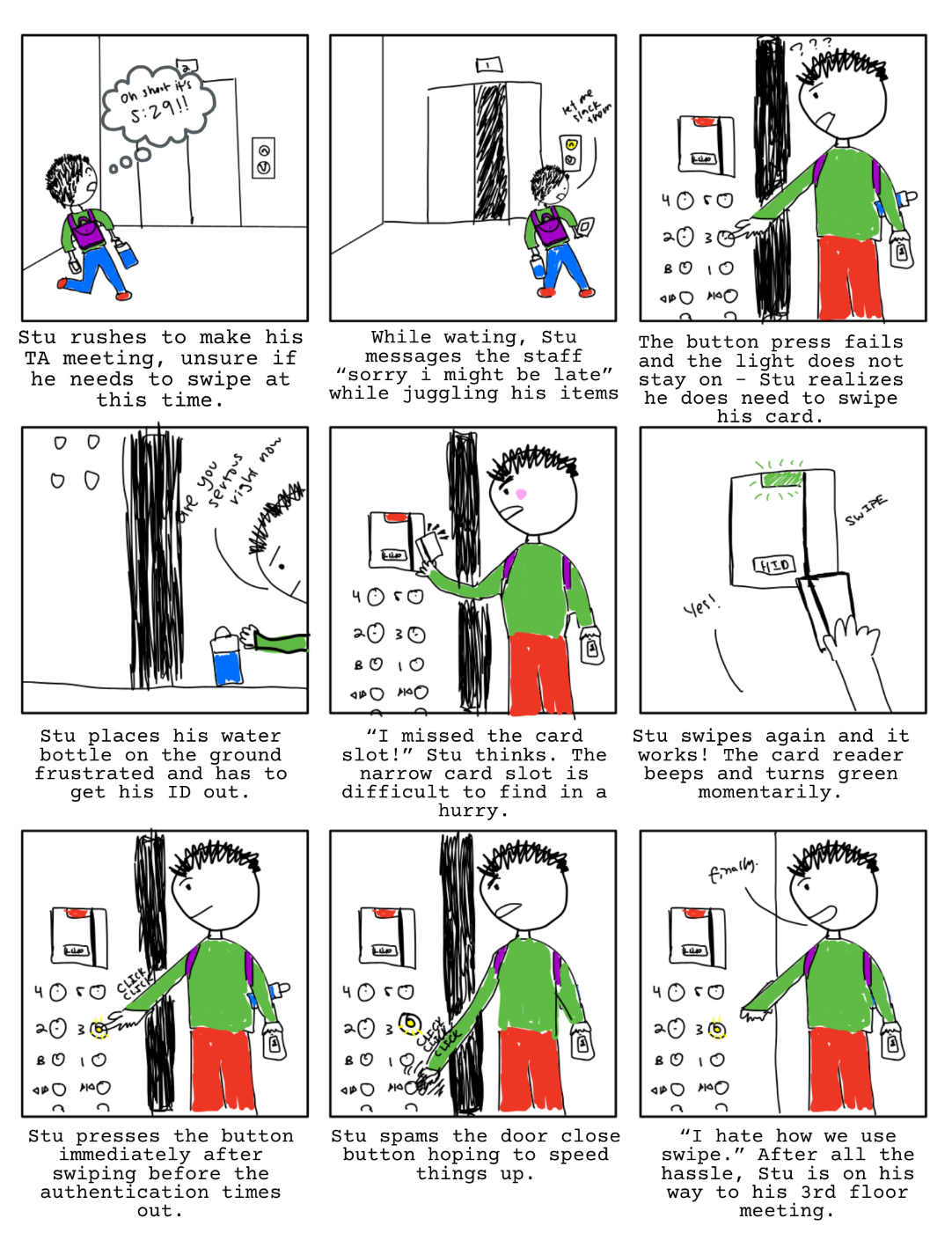
This storyboard helped me visualize opportunities for interface improvements, but also led me to ask: What signals can help Stu trust the system more? What minimal changes could prevent five minutes of unnecessary stress? Seasoned Senior Stu represents a common user experience - even after learning the interface, experienced users still face inefficiencies and frustrations due to a lack of clarity.
Conclusion
The CIT elevator panel failed users in moments that matter - whether it's the anxiety of a first-year or the workflow of a TA. Despite various experience levels, everyone faced usability challenges because of poor memorability and learnability, inefficient design, and lack of inclusive feedback.
As a product manager, I believe accessibility shouldn’t be a feature - it should be a default. Good design reduces friction for everyone, not just those with visible needs.
Next steps
As an impact-driven PM, I don’t just want cleaner interfaces - I want systems that empower more people to move through spaces with confidence! Here’s where I would go next:
- Inclusive research: Interview users with disabilities and non-student groups to understand broader needs.
- Tap implementation: Work with the CS department to implement a tap system with clearer onboarding.
- Better feedback mechanisms: Improve button and swipe reader signals, adding visual or auditory feedback for success and timeout.
- Stakeholder communication: Ensure priorities are aligned with the CS facilities staff; evaluate current constraints and feasibility of change.
Ultimately, through accessibility-minded user testing and product design, we can iterate upon our current systems and build a more inclusive environment for everyone. This mindset will further guide how I lead teams, build products, and advocate for empathy through my future endeavors.